

How to Edit Architectural Photography Right

A striking building image can lose its impact fast if the verticals lean, the windows blow out, or the whites turn muddy. That is why knowing how to edit architectural photography matters just as much as capturing it well. For agents, developers, architects, and property marketers, the edit is where a good frame becomes a marketable asset.
Architectural photography sits in a narrow lane between accuracy and polish. You want the space to feel elevated, but you also need it to read truthfully. Overediting can make a property look artificial. Underediting can leave value on the table. The strongest results come from a controlled workflow that respects the design, the materials, and the purpose of the image.
How to edit architectural photography with a clean workflow
The best editing process starts before you touch exposure or color. Begin by deciding what the image needs to do. A luxury residential listing may need warmth and aspirational brightness. A commercial exterior may need crisp neutrality and structural clarity. An architect's portfolio image may call for more restraint so the design language stays front and center.
That goal affects every choice that follows. If the image is meant to sell square footage and usability, readability matters more than mood. If the image is for branding or editorial use, you may allow slightly deeper contrast or more dramatic sky detail. Editing architectural work is never one-size-fits-all.
Start with your base correction. Adjust exposure, recover highlights, and open shadows carefully. The key word is carefully. Lifting shadows too far makes interiors feel flat and synthetic, especially in corners and under cabinetry. Pulling highlights down too aggressively can make windows look gray and lifeless. Aim for balance, not maximum detail everywhere.
Next, set white balance with the materials in mind. This is where many real estate and commercial images go off track. White walls are rarely truly white under mixed lighting, and stone, concrete, wood, and metal all respond differently to correction. If the color temperature is too warm, modern architecture can feel dated. If it is too cool, inviting residential spaces can feel sterile. Neutral should still feel intentional.
Perspective correction is non-negotiable
If there is one edit that separates casual property imagery from professional architectural work, it is perspective control. Buildings should not appear to fall backward unless that effect is deliberate. Leaning verticals distract viewers and instantly reduce perceived production quality.
Correct vertical and horizontal lines early in the process. Door frames, window mullions, columns, and building edges should guide your adjustments. The goal is not to force every image into a mathematically rigid grid. Wide-angle scenes often need a little natural depth to feel believable. But the overall structure should look stable and true.
There is a trade-off here. Heavy perspective correction can stretch edges, crop usable space, and distort furniture or façade proportions. Sometimes the better decision is to accept a minor convergence rather than overcorrect the frame. That judgment call matters, especially when marketing premium properties where buyers notice visual inconsistencies quickly.
Cropping comes right after. Keep the crop clean and purposeful. Architecture benefits from breathing room, but extra ceiling, pavement, or blank wall does not always add value. Crop to strengthen the composition while preserving the design intent. For listing photography, that usually means emphasizing space, flow, and key features without making rooms feel artificially large.
Color grading should support the property, not overpower it
Good architectural edits feel polished without announcing themselves. That usually means restrained color grading. Materials should look expensive, not saturated. Sunlight should feel natural, not orange. Green landscaping should read healthy, not neon.
A practical approach is to correct global color first, then make selective refinements. Warm up wood tones if they feel dull, but leave concrete and painted surfaces neutral. Reduce green or magenta color casts from reflected light on walls. Watch stainless steel, glass, and glossy finishes closely. They can shift color quickly and make an otherwise premium image feel off.
This matters even more in mixed-light interiors. Daylight from windows, recessed warm fixtures, accent lighting, and exterior spill can all exist in one frame. There is no perfect universal fix. Sometimes you neutralize the entire image. Other times you preserve some warmth in practical fixtures while keeping walls and architectural lines clean. It depends on whether the image is selling atmosphere, design precision, or both.
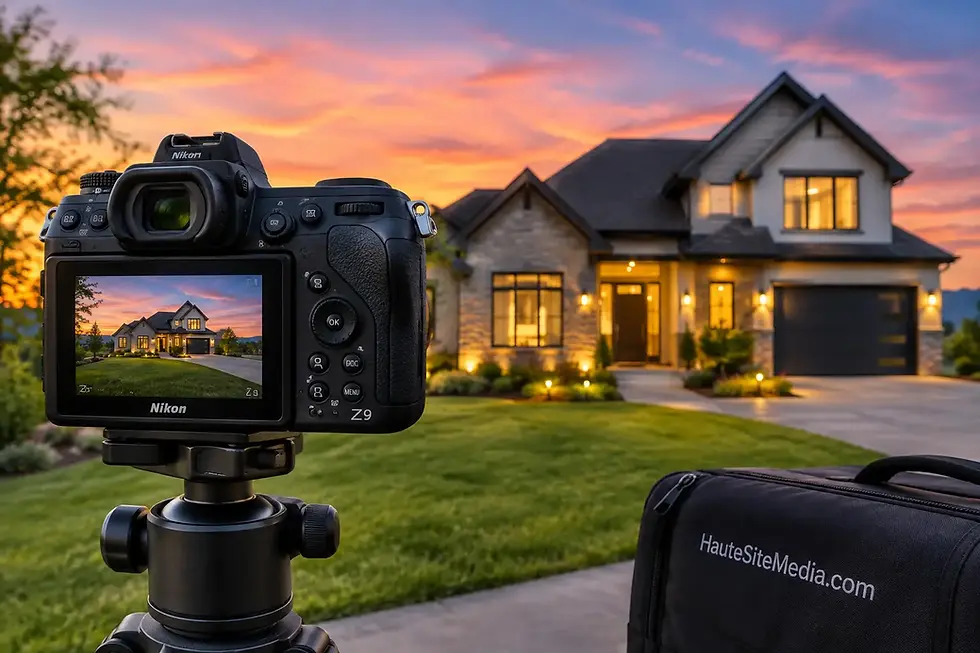
If you are editing twilight exteriors, restraint becomes even more important. Rich blue skies and glowing interiors can look excellent, but they are easy to overpush. Keep the scene believable. The property should feel elevated, not digitally exaggerated.
Local adjustments make the image feel finished
Global sliders get you close. Local adjustments are what make the frame feel professionally resolved. This is where you guide attention without making the edit obvious.
Brighten dark entryways slightly so they do not feel closed off. Add subtle contrast to architectural details that define the space, such as textured walls, millwork, tile patterns, or façade materials. Tone down hot spots on ceilings, glossy floors, and countertops. If the view through the window matters, blend it carefully so the exterior feels visible but not pasted in.
Window pulls deserve special attention. In architectural and property marketing, blown windows can erase context and make interiors feel cheaper than they are. But an aggressively dark window replacement can be just as damaging. The transition between inside and outside should feel natural. If the exterior view is part of the selling point, keep it readable while matching the interior light realistically.
Retouching should also stay disciplined. Remove sensor dust, minor wall scuffs, outlet distractions, or temporary imperfections that are not part of the property itself. Be more cautious with permanent features. Editing out structural realities, neighboring buildings, or design flaws can create a mismatch between the image and the in-person experience. For commercial credibility and listing performance, trust matters.
How to edit architectural photography for marketing use
Editing for a portfolio and editing for a live listing are related, but not identical. Marketing images need to perform fast. They should look clean on mobile, hold up on large screens, and communicate value within seconds.
That means clarity usually beats drama. Keep the image bright enough to read instantly. Maintain contrast so shapes and finishes separate well. Make sure skies, landscaping, interiors, and exterior surfaces all hold together visually at thumbnail size and at full resolution. If a buyer, tenant, or investor has to work hard to understand the image, the asset is underperforming.
Consistency across the full gallery matters too. One image that is warm, one that is cool, one with deep contrast, and one that is flat makes the property feel disjointed. A strong set has visual continuity. This is especially important for developers, multifamily properties, offices, retail centers, and architect-designed homes where brand presentation carries real business weight.
For teams managing frequent listings, speed matters along with quality. A fast turnaround only helps if the edits are consistent and market-ready. That is one reason many professionals rely on experienced media partners rather than handling every frame in-house. Haute Site Media, for example, works with clients who need polished property visuals delivered on tight timelines without sacrificing the finish that drives stronger first impressions.
Common editing mistakes that hurt architectural images
The most common problem is overprocessing. Oversharpening creates crunchy edges around lines and fixtures. Excessive HDR makes interiors look muddy and unnatural. Heavy clarity can make premium finishes feel harsh. These edits may seem impressive at first glance, but they reduce trust and cheapen the presentation.
Another frequent mistake is ignoring geometry. Even beautiful light and color will not rescue an image with crooked verticals or a drifting horizon. Viewers may not name the issue, but they will feel that something is off.
Then there is color inconsistency. Mixed whites, green window spill, and orange ceiling casts can make an expensive property feel visually messy. Architectural editing should simplify the image, not add confusion.
Finally, many editors try to make every frame equally bright. That is not always the right move. Some spaces need contrast to preserve dimension. A moody lobby, a shaded exterior, or a dramatic stairwell can lose its character if everything is flattened for uniform brightness.
The best edit is the one that makes the design feel clear, elevated, and believable. If the viewer notices the architecture before they notice the editing, you got it right.


Comments